Getting a potential buyer to land on your product page means you’ve done something right. It means that someone is interested in what you sell, and there’s a good chance they’ll buy from you.
That means your product page had better be good. You’ve only got a couple of seconds to grab their attention and convince them to give you some of their hard-earned paychecks.
The job of your product page is to cause everyone who views it to say one of two things:
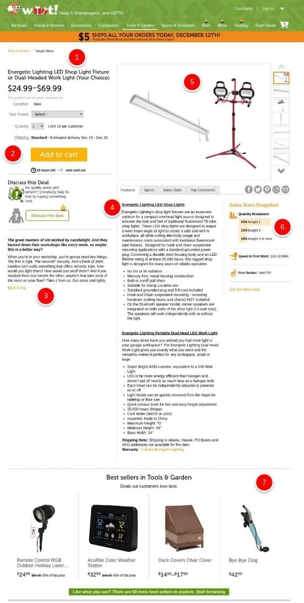
Let’s take a quick look at a Woot.com product page and see what is going on that works well.
Let’s think about the possible outcomes when someone views your product page:
These first two outcomes happen when your product page gives them all the information they need to make a buying decision and they understand exactly what they are getting. The product page is performing perfectly. But… what if it doesn’t?
These negative outcomes happen when you haven’t conveyed your product in a way that matters to the buyer. The buyer has to make a decision based on the information you give them.
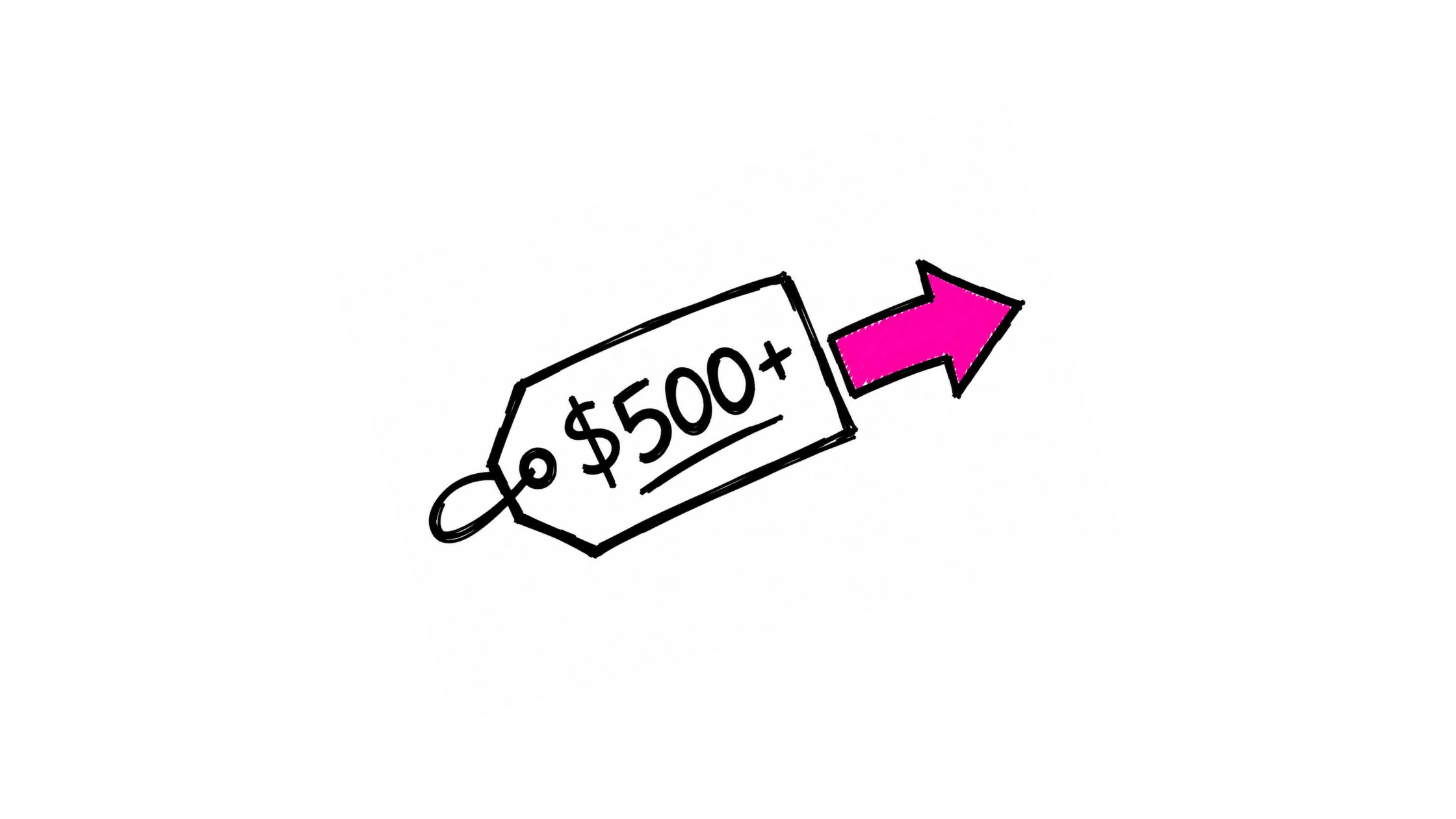
Good product pages make more sales. They lead to more happy customers, more good reviews, and a more profitable store. If you want to improve your conversion rates, product pages are a great starting point. Alongside product page optimization, tools to boost your conversion rates that reward customer advocacy give you a sustained lift well beyond the initial visit.
Good product pages are focused. They show us all the information we need to know about a product. They convey a sense of the ideal buyer and how the product will meet their needs.
The content of your product pages must communicate everything that a buyer needs to know about your product before they make a purchase decision:
It’s a lot of message to get across in little space, but if anyone is going to give you their money, it’s your job to make sure they feel good about doing it.
Luckily, you’ve got powerful tools to make that happen.
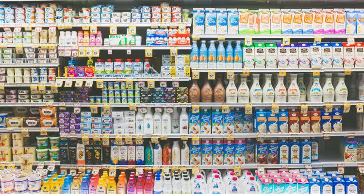
Images convey information about your products quickly and easily to buyers. High-quality images are a must-have for a high-performing product page.
Words that speak to and focus on your buyers show the difference between you and the competition. Words allow you to tell stories and create a connection between the product and the buyer. Injecting brand personality humanizes the sale and adds to the gap between you and your competition.
Design is the visual language you use to order your content. Good product pages are easy to navigate, uncluttered, and attractive. This article is focused on optimizing the actual content of your product page, but here are some resources for improving design:
The biggest thing we lose when we buy online is the ability to see something in real space. To touch it, to feel its weight, to gauge its quality. We can’t fully overcome that. But we can make sure that our product images are top-notch and relay every possible bit of information about the things we sell.
Whether you are shooting your own product photos or hiring a professional, quality matters. Investing in photo quality is one of the single most important things to optimize the performance of your product pages.
White backgrounds are great for showing off products themselves, but there is a solid case to be made for providing context in your photos as well. Using intentional backgrounds and setups, you can add brand personality and build a connection with the viewer that white backgrounds just can’t convey.
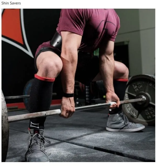
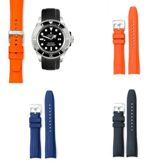
To combat your buyer’s inability to pick an object up and examine it closely, you’ll need more than just one or two images, no matter how high-quality they are. Think like a customer, and ask yourself what you would want to see before you buy.
Source: Pixc
The pen is mightier than the sword, and great product copy is mightier than fear of the buy button. As a consumer, I will spend hours scouring product descriptions and specifications before I make an important purchase. Stores that communicate the value of their product win the sale.
Your product name should accurately convey what it is that you’re selling without being overly technical. Having product names that match what buyers will search for increases your chances of showing up in a prominent spot in search results.
It seems counterintuitive, but product descriptions shouldn’t just describe the product. Chances are, the buyer has other options very similar to what you’re selling. If they don’t feel a connection or see a difference, they’ll go for the lowest price.
Art of Manliness did this with a Zippo lighter. You can buy some form of Zippo in almost any gas station around the world, what is there to say about this one that could possibly make it unique? But to any man who has read the book they quote in their product description, Cormac McCarthy’s The Road, what was just another Zippo has now turned into an emotional must-buy. At the time of writing, the lighter was completely sold out.

Sometimes, there is more to convey about a product than what fits easily into your product description. If it matters to your buyers, you should find a way to let them know. This could include:
Additional information is best placed below the fold, with the focus of the page on the product images and main description. Drop-down tabs, toggles, and in-set sections are a great way to display additional information without cluttering the page.
Optimizing your product pages to make sales doesn’t require a magic touch. All it requires is the willingness to focus on your buyers and on how your products fulfill their wants and needs.
Answer questions, create a desire for the product and show it off at it’s very best. Do those things, and you should have a high-performing product page.
Hey! Improve your product pages further with our Ultimate Storytelling Guide here.


Rachel Jacobs is Head of Content and Partnerships at Pixc, a leading eCommerce product optimization service. Pixc transforms average product photos into professional images designed to increase conversions. A lover of all things content and growth, Rachel spends most of her time planning new content, fine-tuning growth strategies and tweaking email campaigns.
Grow your sales at a ridiculously
lower CAC.
.jpg)