Their site is bright, cheery and very easy to understand.
I'm particularly a fan of their copywriting, which shines with sincerity:
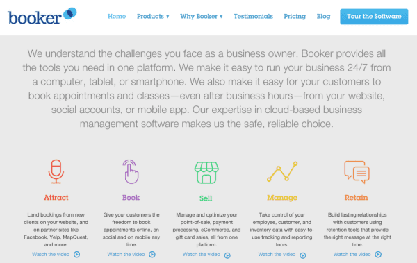
Normally I'd argue that less is more, but in this case the copy– with its lengthy sentences and fragments– feels intimate, not overwhelming.
"We understand the challenges you face as a business owner" addresses the persona very well.
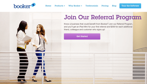
This is a great idea– instead of simply telling you that you should be referring your friends, Booker informs you about the kinds of people who refer them.
Give the reader a simple choice. You may instinctively wonder "Which type am I?" (there are practically millions of "which type are you" quizzes online at this point), and then feel compelled to join.
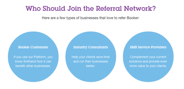
More visual variation, please: My only (minor) gripe is that the three categories are visually identical. Even variations in color might be good– and they could apply the same copywriting skills they used on the landing page to craft more compelling value propositions.
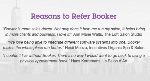
This is great – I can never understate the power of social proof.
Nobody likes to make decisions on websites without knowing if they're making a mistake, or if they're getting scammed. Just having a quote from a satisfied customer goes a long way in reassuring people that they're about to do something positive.
To emphasize that all you can!
Check out more B2B referral program examples right here.
And if you're ready to get started, use ReferralCandy's affiliate and referral tool to launch your own program today!


Visa is ReferralCandy's former Blog Editor [2013–2018]. He also co-founded Statement.sg, a fashion ecommerce label selling witty t-shirts. He's mildly Internet-famous for his elaborate Twitter threads. He hopes to enjoy a glass of scotch onboard a commercial space flight someday.
Grow your sales at a ridiculously
lower CAC.