
Most online stores rely on product pages. These pages work like a Swiss Army knife, providing visitors with everything they may need: product images, a product description, key details (price, features, customization options, etc.) and navigation links that allow the visitor to quickly access other areas of your site.
All this content is necessary, but it can also be overwhelming. A large amount of information, even if it’s helpful, often results in analysis paralysis rather than a sale.
That’s why, in addition to product pages, you should be using landing pages to convert visitors into customers.
A landing page is designed for a specific campaign, such as a series of ads or an email blast. Landing pages are more like a power drill than a Swiss Army knife — they only have one use, but they’re extremely effective.
While product pages need to be informative, landing pages are entirely focused on conversion. They’re stripped of all distracting details, presenting only the minimum content required to persuade the visitor to order your product, sign up for your newsletter or perform whatever other action it is that you want them to perform.
Optimizing your conversion funnel extends beyond landing pages — see ReferralCandy's plans to add a referral layer that delivers pre-warmed visitors who convert at significantly higher rates than cold traffic
Let's check out some of the best eCommerce landing pages of 2020, and what you can learn from them as we enter 2021.
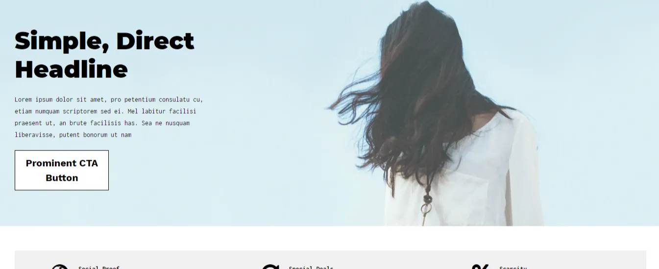
This looks good enough to be a real ecomerce landing page -- but read closer, it's a blueprint
The most successful ecommerce landing pages all pull from the same list of ingredients, which includes:
When designing your own landing pages, it’s helpful to see what other stores are doing for inspiration.
Let’s take a look at the top ecommerce landing pages of 2021 and review what makes them so compelling. We organized them into four categories: instantly clear value proposition, trust seals and social proof, urgency and interactive experience.
These companies don’t waste any time getting to the offer.
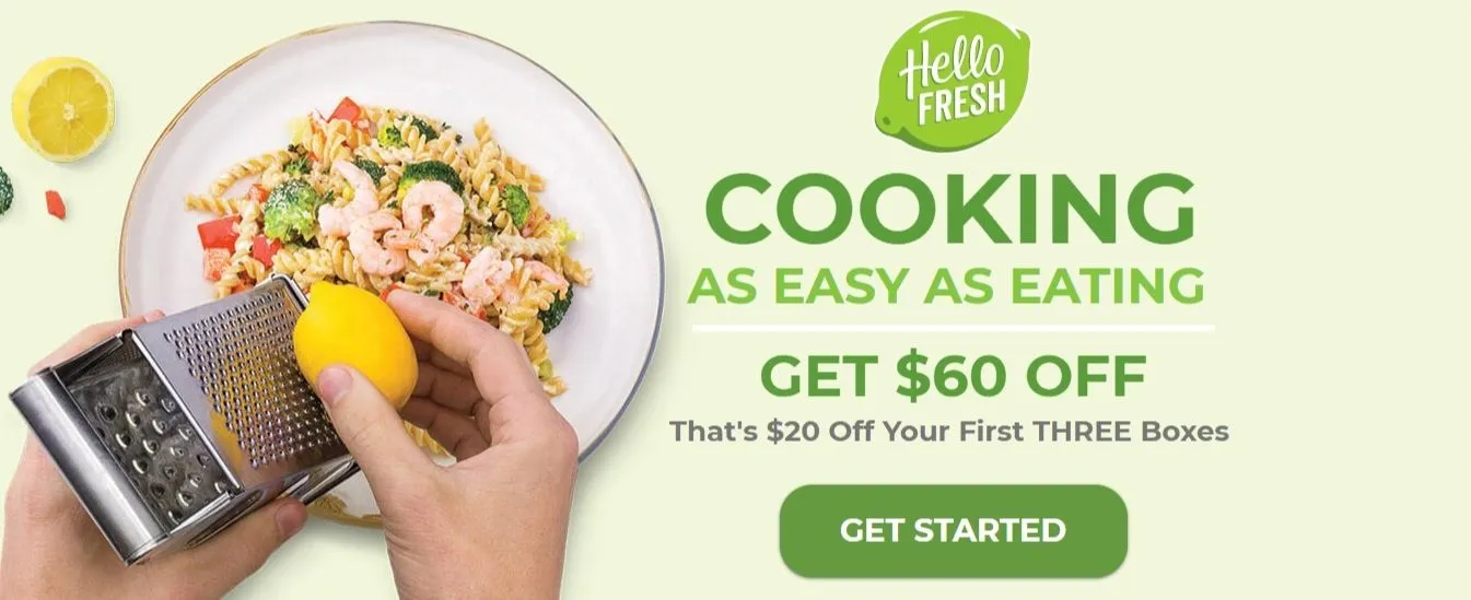
This HelloFresh landing page is a prime example of simple, bold design. The full-width background image features a fresh and tasty-looking meal and entices the visitor to try the service. The “Cooking as Easy as Eating” headline is as short as it is persuasive, and the “Get Started” CTA button stands out with both its size and a color that sharply contrasts with the background.
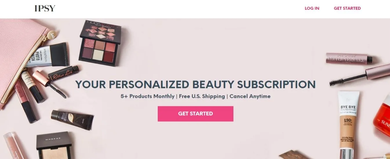
Like the best full-width background images for landing pages, Ipsy shows the visitor just what they’re missing out on. Promises of “Free U.S. Shipping” and “Cancel Anytime” make the visitor even more inclined to subscribe to the beauty subscription service.
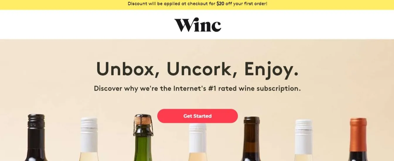
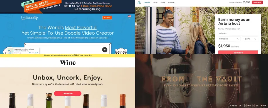
You know by now that it’s important for landing pages to have a concise headline. Well, it doesn’t get much more concise than three words. With “Unbox, Uncork, Enjoy,” Winc provides a full description of its subscription service faster than you can say “one Mississippi.”
If the thought of relaxing with a glass of wine delivered straight to their doorstep wasn’t enough to convert the visitor, a banner at the top of the page promising $20 off their first order is there to give them an extra push.
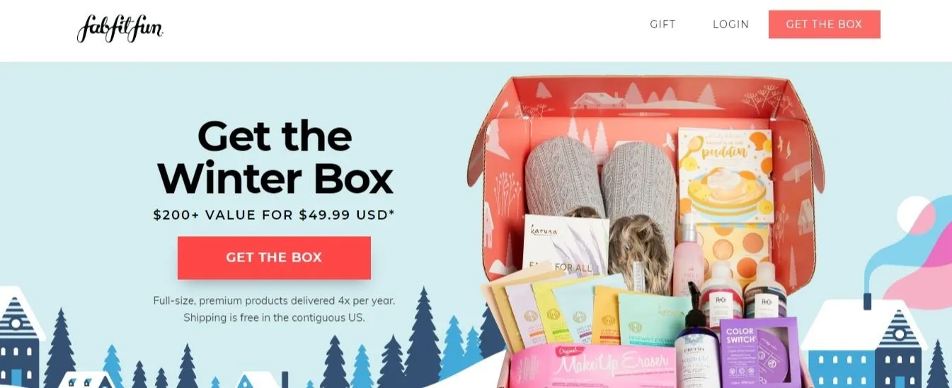
FabFitFun is a monthly subscription service that caters to users who love wellness, beauty and fashion. On this landing page, FabFitFun show the visitor exactly what it provides and communicates the value of its service with language such as “$200+ Value For $49.99 USD” and “Shipping is free in the contiguous US.”
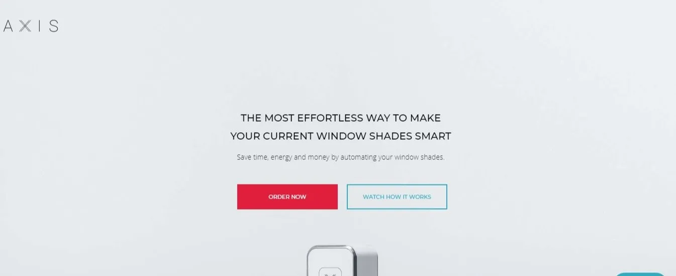
The Axis Gear is a device that automates window blinds. You can set your blinds to open and close on a schedule and even integrate them with other smart home devices.
With an innovative tech product like this, it’s tempting to immediately start explaining all the exciting features and benefits to visitors. Axis wisely avoids this temptation in its Gear landing page. The company sticks with a succinct description in the premium real estate at the top of the page and saves the details for below the fold. This allows them to hold the attention of visitors and increase its conversion rate.
These companies display why consumers (and their friends) should buy from and trust them.
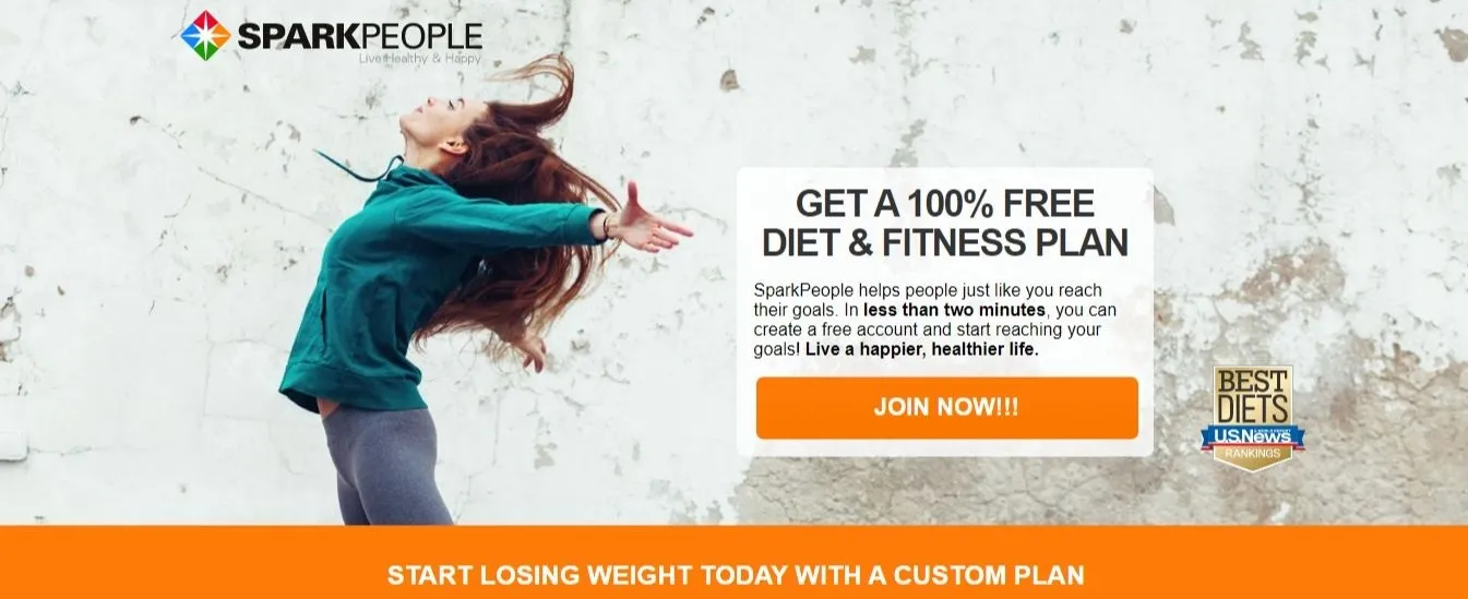
In this SparkPeople landing page, you see many of the elements featured in the examples above: a striking full-width background image, a prominent CTA button and a concise headline.
The page also includes what’s known as a trust seal by featuring a “U.S. News: Best Diets” badge. By showing visitors they’ve earned the approval of a renowned publication like U.S. News & World Report, SparkPeople helps convince visitors that its diet and fitness plan is worthwhile to purchase.
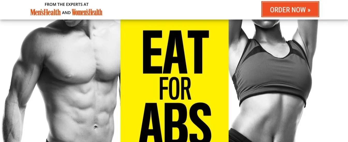
The landing page for “Eat for Abs,” a book published by the mass media giant Hearst Communications, serves as another crash course in simplicity. The background image of sculpted abs reminds visitors of what the product can do for them, and the Men’s Health and Women’s Health magazines logos at the top of the page are potent trust seals.
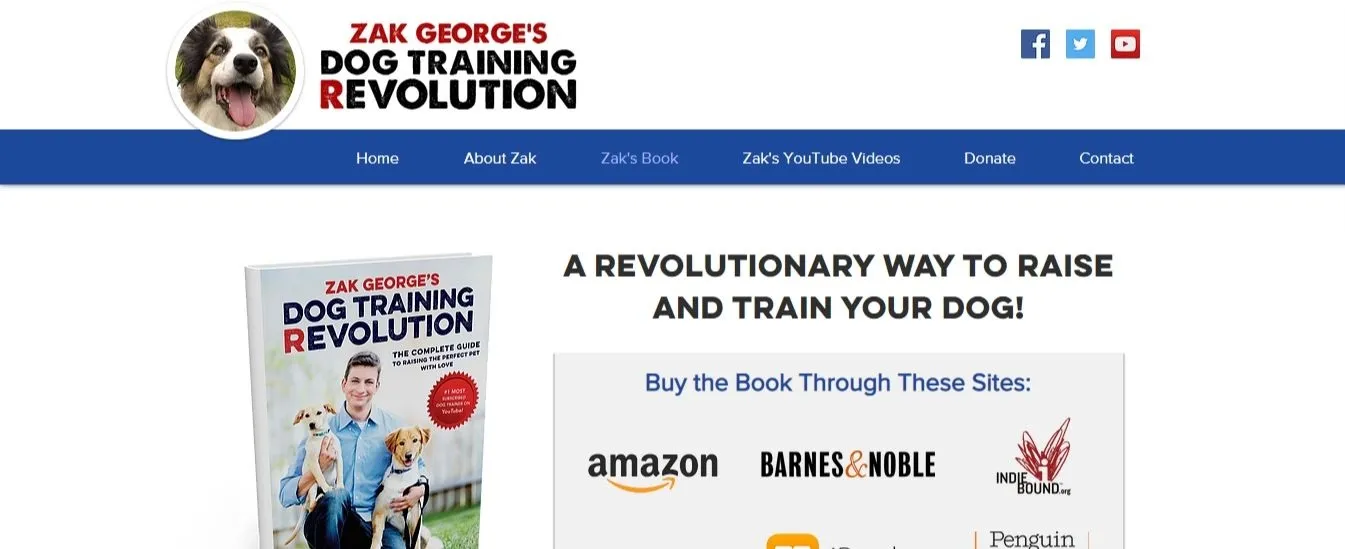
Here’s a landing page for Zak George’s Dog Training Revolution, a dog-training service. By highlighting that “Zak George’s Dog Training Revolution” is available through top book sellers including Barnes & Noble and Penguin Random House they help increase the legitimacy of the product.
Note that this page also uses the logos of the book sellers instead of listing them in plain text. These visual trust seals make the legitimacy effect more pronounced.
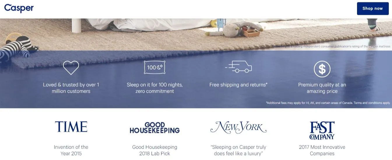
With a few quick bursts of copy, Casper covers all the bases of exceptional landing page design. The mattress company promotes “Loved & trusted by over 1 million customers” for social proof, along with attractive deals such as “Free shipping and returns” and “Sleep on it for 100 nights, zero commitment.”
On top of that, there are high-authority trust seals from the likes of Timeand Good Housekeeping magazines. It’s truly an impressive display.
These landing pages use time-sensitive, urgent words that sell and offers to lure users in.
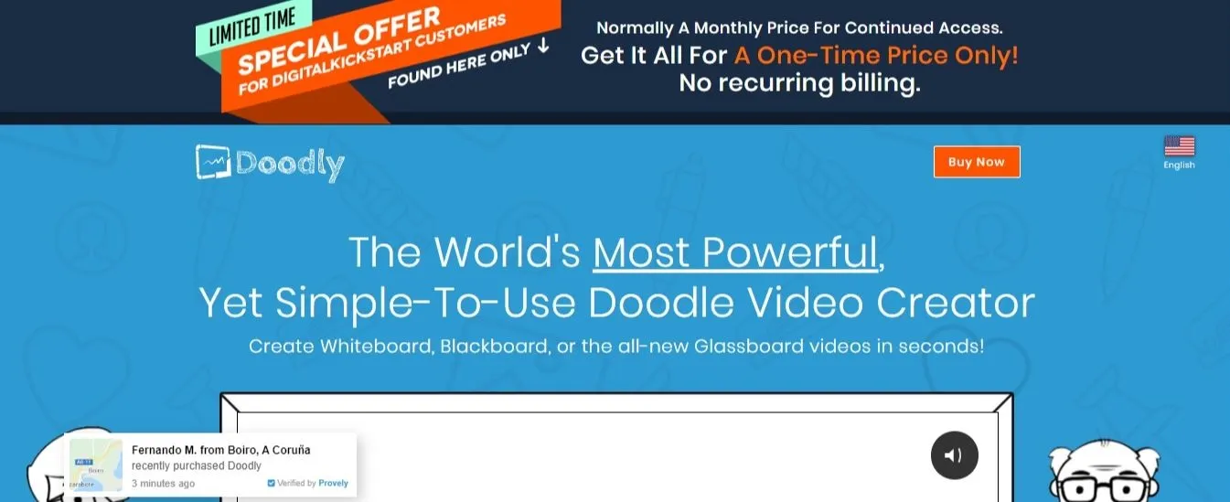
Doodly is a doodle video creation software. With urgent language at the top of the page, such as “Limited Time Special Offer” and “One-Time Price Only,” this landing page immediately encourages the visitor to make a purchase now rather than later.
The headline does a good job at communicating the value of Doodly as well, quickly getting to the point that the product is both powerful and easy to use.
Finally, Doodly uses the Provely app to add social proof with pop-ups describing the name and location of people who recently purchased the product. This is a very efficient way to show visitors that other people have made the decision to buy Doodly, so maybe they should, too.
By this point, you may have noticed a pattern: Food-related retailers tend to use perfectly staged photos of the meals they offer possible on their landing pages. The sight of good food can easily cause cravings and convince visitors to pull the trigger on an order, so this is only common sense. If you run a food-related store, you should do the same.
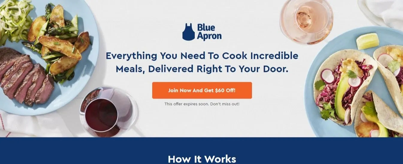
This Blue Apron landing page also employs the urgency tactic well with “Join Now and Get $60 Off” in the CTA button and “This offer expires soon” below it.
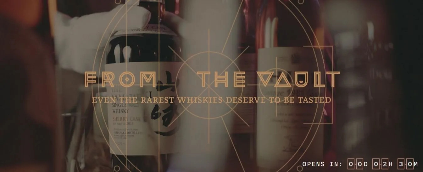
Flaviar uses a countdown clock feature to emphasize the scarcity of the rare whiskies featured on its “From the Vault” landing page.
When the Vault is closed, the clock counts down the minutes that remain until it’s open, which builds anticipation for the release of its products. When the Vault is open, the clock counts down to when it will be closed again, putting pressure on the visitor to buy now.
These landing pages make engagement with the user a top priority.
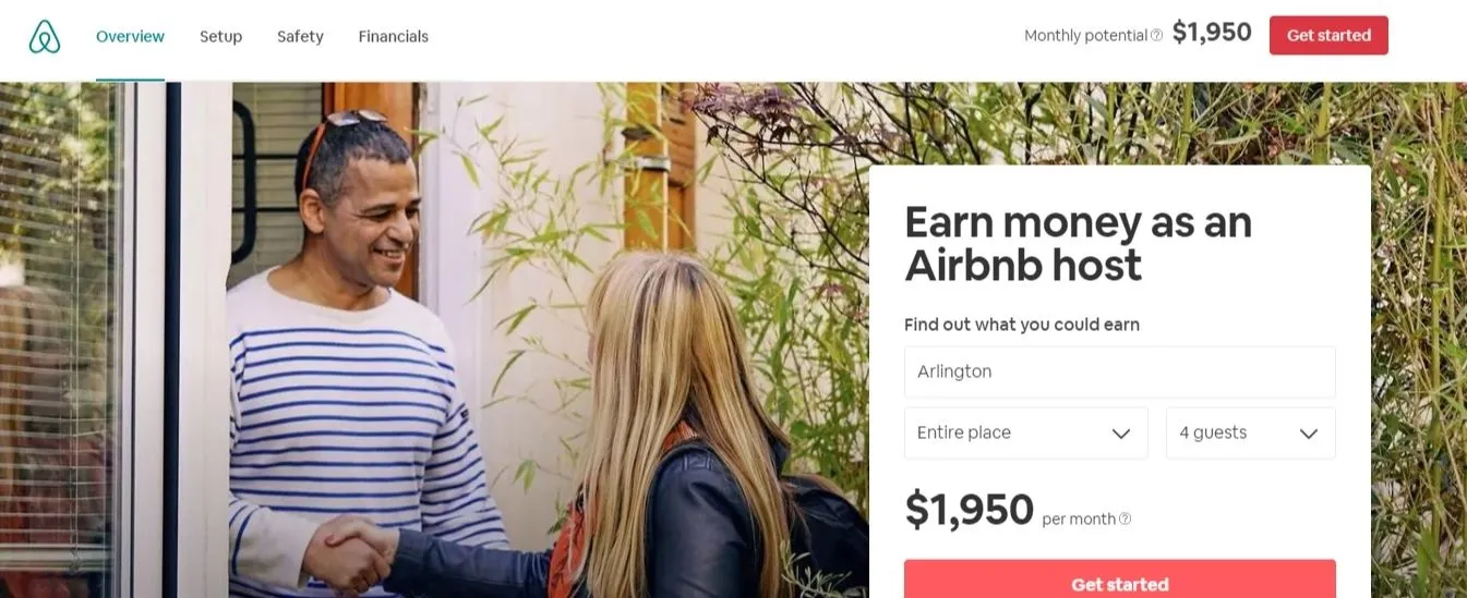
Airbnb was smart to include a specific dollar amount for how much hosts can earn by renting their property in this landing page.
A vague offer to earn more money is somewhat enticing, but telling visitors exactly how much they can earn is much more powerful. That way, visitors can envision what the money would enable them to buy, and the thought of those physical items may very well convince them to click “Get started.”
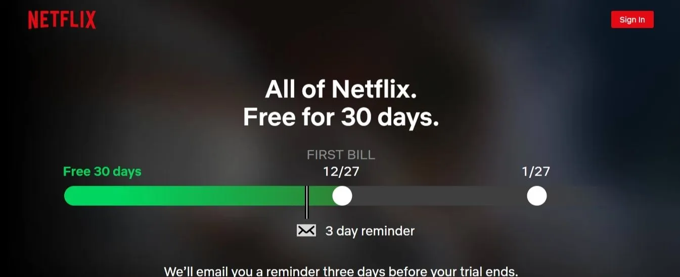
Netflix’s homepage is designed like a landing page for new users. The streaming service cleverly uses imagery to support its copy and get the point across.
The simple timeline chart helps visitors visualize how long they’ll be able to take advantage of their free trial. And if they’re worried they’ll forget about the trial and be charged for the first month, Netflix alleviates those concerns with the promise of a reminder email three days before the trial ends, which is also clearly displayed on the chart.
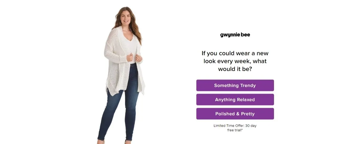
The clothing rental subscription service Gwynnie Bee shows that there are exceptions to every rule in ecommerce.
Usually, you should only have one button on your landing pages. However, this Gwynnie Bee landing page has three buttons, which it uses to kick off a survey. The multi-button approach works in this case, as they all essentially go to the same place and they emphasize the personalized nature of this service.
If you don’t have any experience with web development, don’t fret; you can still create top tier landing pages like the examples above for your website.
The fastest way to create professional-level landing pages is by using a page builder app. These tools allow you to completely design landing pages from scratch using a drag-and-drop platform — no coding necessary.
When you start creating your own pages, follow the latest landing page best practices to make sure you’re optimizing your site to maximize your conversions.

Adam Ritchie is a freelance writer based in Silver Spring, Maryland. He currently writes for Shogun, and his previous clients include Groupon, Clutch and Showbiz Cheat Sheet.


Darren is a content/SEO writer and product marketer. He doubled search traffic for the blog and put ReferralCandy on the front page of the Shopify AppStore.
Grow your sales at a ridiculously
lower CAC.


.jpg)