So you've been running a business for a while, and things are going well. However, you think your logo might be a little dated, and would like to jazz things up with a new logo design. Should you do it?
To consumers, the logo represents the 'face' of the company. It communicates the company's values, history and fundamental characteristics.
While a bad app redesign won't really affect sales figures, it's a wasted opportunity to give consumers a pleasant surprise. A good logo redesign is a fun talking point, and raises the profile of a brand.
But beyond visuals, brands can also grow awareness through referral marketing tools that reward loyal customers for spreading the word.
So then, what should you do? Before you decide on anything, allow us to walk you through some redesigns that didn't quite work:
Before:
After:
In 2009, Kraft Foods Inc. introduced a new corporate logo to "to more clearly deliver 'delicious'", which gained a lot of flak for just about everything. The smile, the colorburst, the colors, and the cheesy (I know) italics weren't well-received. The reaction showed how difficult branding can be, even when companies use tools like a make your own AI logo maker to experiment with smiles, color bursts, colors, and stylized italics.
This comment, "1 swoosh, 1 capitalized word, 2 fonts, 3 weights, 4 lower-case words, and 9 colors for 1 LOGO" pretty much sums things up.
The logo was ranked the 6th worst logo of 2009 by Brand New.
Then:
5 months later, Kraft introduced a new corporate logo, which was supposedly an improvement of the previous one.
The switching of the angle of the smile, the even larger colorburst, and the non-italic tagline not only didn't help the situation, but conveyed the impression that the company is fickle-minded.
This new logo was ranked the 5th worst logo of 2009 by Brand New.
finally, to:
In 2012, Kraft Foods Inc. split into Mondelēz International and Kraft Foods Group.
As a result, a new, modified version of the classic and memorable 1976 logo was introduced for Kraft Foods group. Whew.
Why it didn't work:
From:
to:
In 2010, Gap ditched the classic blue square logo, which had been around for more than 20 years. A new logo was introduced to mark a transition from “classic, American design to modern, sexy, cool.” I'm not sure which part of the new logo was meant to express 'modern, sexy, and cool'. The blue gradient square?
After gaining huge amounts of negative criticisms online, Gap decided to switch back to the previous, more classic design. Smooth move.
Whether you’re revamping a logo or exploring affiliate marketing strategies, consistency and authenticity are key to keeping customers loyal. If you’re looking for professional help with your logo design or redesign, platforms like Crowdspring offer access to a wide network of creative designers who can bring fresh ideas to your brand identity.
Why it didn't work:
From:

To:
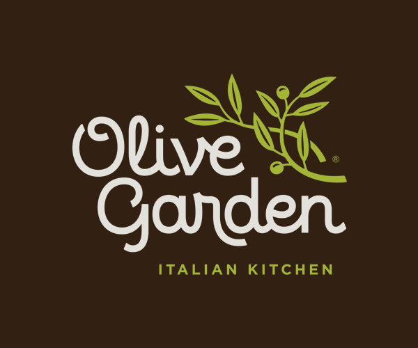
In an attempt to stop their declining sales, Olive Garden pushed out a new logo, which would supposedly mark the coming of a 'brand renaissance'. The critics, however, didn't quite agree. Some said it was 'horrible', a 'joke', and another even said that it 'looked like a Design 1 student project'.
Why it didn't work:
To check out some of the better logo redesigns, check out the post by Business Insider here.
As legendary logo designer Paul Rand mentioned, "It (a logo) derives its meaning and usefulness from the quality of that which it symbolizes. If a company is second rate, the logo will eventually be perceived as second rate."
A great logo helps, but strong customer relationships are what truly build brands. Start growing yours — check ReferralCandy’s pricing plans to see how referral marketing can help.
P.S. Whatever you do, avoid coming up with a logo like this:
Post inspired by: AdAge.com – When Good Logos Go Bad
Images courtesy of Kraft Foods Group, Gap Inc. & Darden Restaurants Inc.


As a finalist in Esquire's Best Dressed Real Man contest, Samuel is ReferralCandy's fashion eCommerce expert and resident sartorialist. He is obsessed with human behavior, social psychology, and handstands. He is also the lead calisthenics trainer at Weightless.
Grow your sales at a ridiculously
lower CAC.